Ignatz Wiemeler and his ingenious bindings
A highlight in the collections of the Klingspor Museum Offenbach
Text of a paper given by Rosita Nenno at the conference of the Association of European Printing Museums, After printing: bookbinding as cultural heritage, Imprenta Municipal – Artes del Libro, Madrid, (Spain), 24-26 May 2018.
Rosita Nenno, art historian/curator, Frankfurt/Main, Germany ![]()
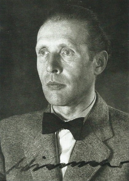
Ignatz Wiemeler was born in 1895 in Ibbenbüren, Westphalia the son of a bookbinder. After his apprenticeship, he studied bookbinding at the Hamburg Landeskunstschule in the workshop of Franz Weisse and, after the First World War, decorative art with Anton Kling and Carl Otto Czeschka at the Hamburg Kunstgewerbeschule.
In 1921, Hugo Eberhardt, director of the Technische Lehranstalten Offenbach as well as the founding director of the German Leathermuseum, gave him a call to his art school, where Wiemeler met with Karl Klingspor, a great bibliophile and – with Richard Doetsch-Benziger in Basel /Switzerland – his most important commissioner and collector of his bookbindings for over thirty years.
Wiemeler stayed in Offenbach until 1925 when he moved to Leipzig to teach as a professor of book arts at the Leipzig State Academy for the Book Trade and Graphic Arts (Akademie für graphische Künste und Buchgewerbe) for the next twenty years.
Bombed out three times, by the end of the war he moved to St Peter, in northern Germany, where he was the head of the bookbindery class at the Landeskunstschule Lerchenfeld in Hamburg until his early death in 1952.
Wiemeler’s oeuvre includes around 300 bookbindings, today in public and private ownership, the biggest amount (50 books) are at the Museum für Gestaltung in Basel and – even more important with about one hundred volumes – at the Klingspor Museum for International Book Art, Typography and Calligraphy in Offenbach on the Main, where I set the focus for my paper.
The Klingspor Museum was founded in 1953, based on the private collection of Dr. Karl Klingspor (1868-1950), who, together with his brother Wilhelm, had run the type foundry Gebr. Klingspor in the first half of the twentieth century. The brothers had taken over the foundry in 1892 under its original name Rudhard, and they led it to an astonishing bloom, culturally and, for many years, also economically. The foundry was prominent in the so-called fractur fonts, but also visualizing the transition between Historism, Art Nouveau and New Objectivity.[1]
Wiemeler was solicitated for many exhibitions in Germany, France, Great Britain etc. His solo exhibitions in the USA during the 1930s at Columbia University, at the Museum of Modern Art in New York and at Harvard University have also given him a certain celebrity and new collectors on the other side of the Atlantic. His bindings are not on constant display and can only be consulted by appointment so, given my knowledge of his work I thought that it would be worth showing some of Wiemeler’s most beautiful creations with no major new research results but rather with my personal views on it. The focus will be more on the design than on the execution but you can be sure that it has always been exquisitely executed with high quality materials. As the website germandesigner.net has commented: ‘His bookbindings were never less than magnificent’.
In additon to works from the Klingspor Collection I will show scans from Kurt Londenberg’s Werkverzeichnis to complete and to compare (items marked KL and number).
The Offenbach years 1921 -1925
Very much influenced by the English romantic bookbinders, especially for the exquisite craftsmanship, Wiemeler has always been open to inspirations of his time. Therefore I want to start with a very uncommon binding in pigskin with hand tooling from 1922.
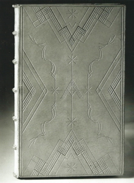
KL 17 Die Offenbarung des Johannes, that I have never seen in original, is in a private collection. The composition of the cover is, despite its symmetry, full of dynamic movement due to the mountainlike zigzags and the multiple triangles pointing from the outer frames to the center, where an angular A (for Alpha – the back cover has an O for Omega) is pierced through by a cross, ending in simple stars. The surface in between the tips is showing two vertical lines composed of curved segments, crossing, overlapping and opening up in diverse angles so that they emphasize the dynamic. Kurt Londenberg calls it ‘A bookbinding in the Art Deco style’ and I am sure, you agree.
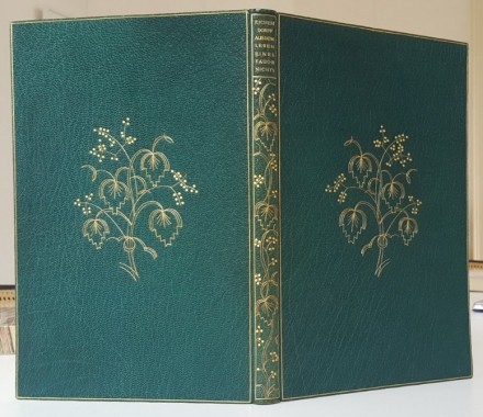
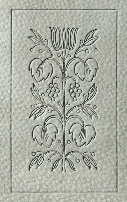
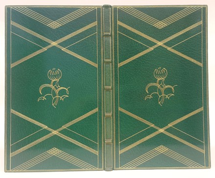
KL37 Eichendorff, Aus dem Leben eines Taugenichts, 1923. More typical for this early period are the bindings with a stylized floral pattern at the center of both boards, mirrored and sometimes showing curved lines, spirals or hatchings. The decoration does not fill the entire surface so that the structure of the leather shows all around.
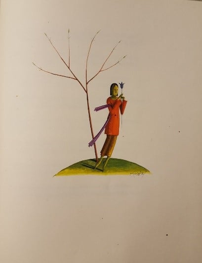
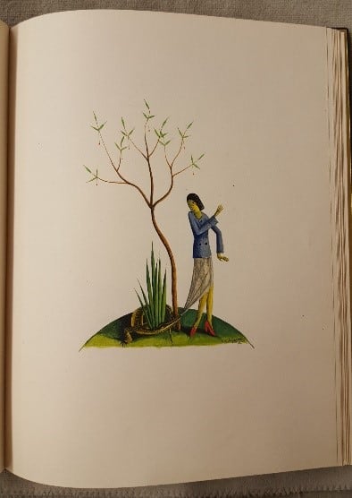
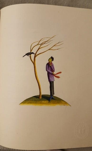
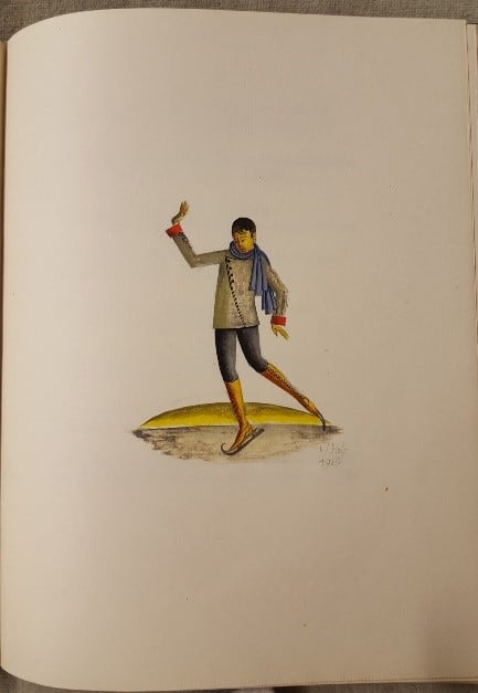
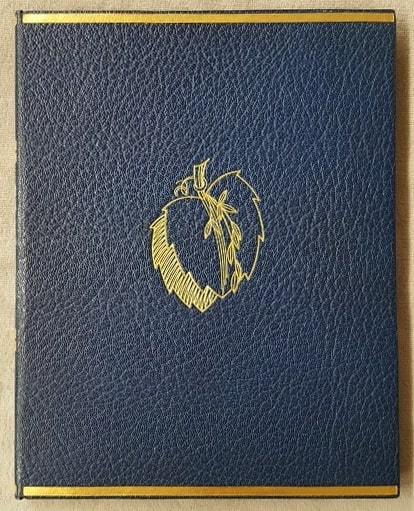
The same can be said for KL 7 Goethe, Die Vier Jahreszeiten, 1921, and although it is not my main topic, I would like to show also the beauty of the book inside the binding: Four volumes of the Vier Jahreszeiten have been illustrated by original watercolors of Heinrich Holz for the future four most important collectors of Wiemeler’s bindings. (Johann Wolfgang von Goethe. Die Vier Jahreszeiten. 1924. First binding for Ernst Engel. Klingspor Museum. Others for Karl Klingspor, Richard Doetsch-Benziger, Siegfried Guggenheim:
Handpressendruck von Ernst Engel, Offenbach am Main, 1921. Typeset in Tieman-Mediäval-Kursiv. The stringency or rigor of the bookbinding is colorfully contrasted by the lightness of the illustrations.
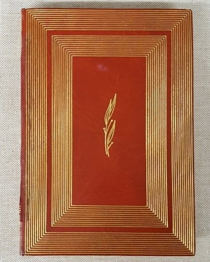
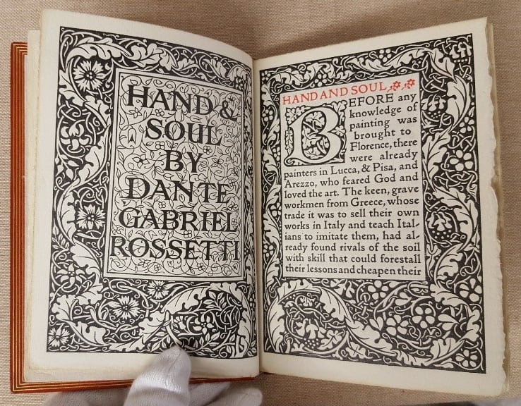
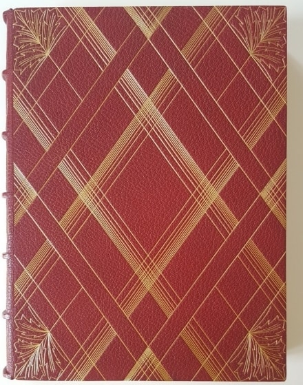
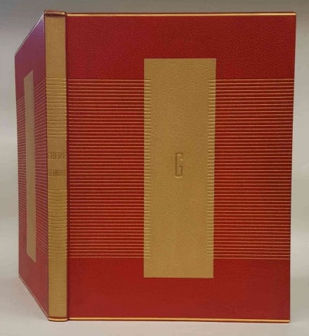
And Wiemeler feels always free to interpret the content of a book, as seen in the glossy red binding of KL 54 Dante Gabriele Rossetti’s Hand and Soul (1924-25) – the book with opulent arabesque framework from 1895 finds its analogy thirty years later in a double frame, composed of multiple parallel gilded lines and a very soft stylized plant, mirrored on both boards. And there are variations of the composition: The two volumes from 1927, KL 108 Jerusalem, Aufsätze und Briefe and KL 109 Hamsun, Pan, live out of the triad:
line – surface = equal material – and stylized floral ornament.
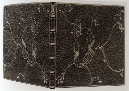
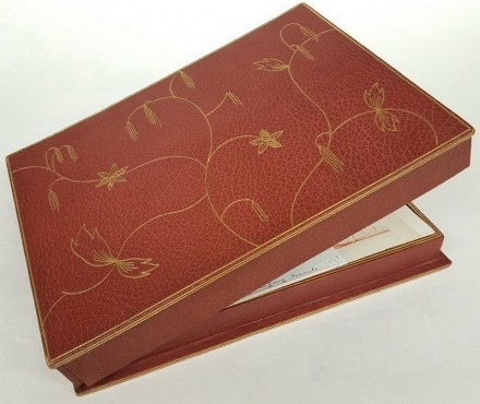
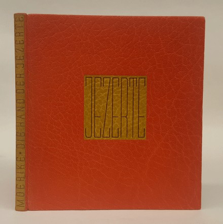
And there is even more freedom in the all over compositions of KL 65 Mörike, Die Hand der Jezerte, a dark green morocco leather binding with handgilded, playful phantasy plants, 1925-1929. Londenberg attributed the binding to the Klingspor Museum, but he probably inverted two numbers. The one I start with should be in a private collection, I only know it from the picture in Londenberg’s Werkverzeichnis. The style of this Jezerte is very close to the not yet published case for graphic work for Walter Tiemann, director of the Staatliche Akademie für graphische Künste und Buchgewerbe in Leipzig, designed and made by Ignatz Wiemeler in 1926 even there. It shows fine lines for the branches and a very lightly repartition of stylized flowers and leaves.
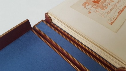
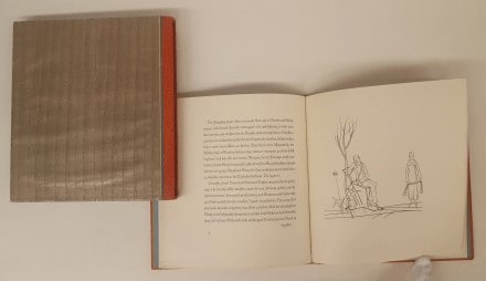
The inside of the box from the Klingspor Museum shows the dedication and the fantastic execution by Wiemeler as well as the ever-surprising silk lining he seemed to like. And that, let me add a personal remark, is sometimes quite irritating as a contrast of material and color.
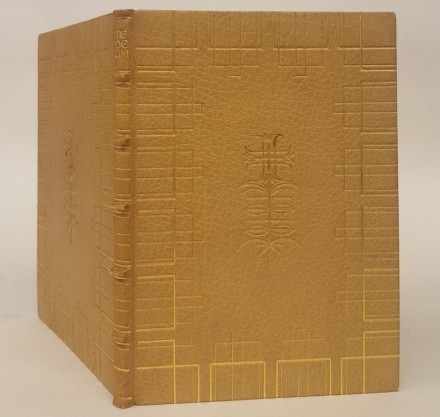
More rigid are some variations of the framework plus, sometimes more, sometimes less abstract floral center pattern in the two works from 1924: KL 41 The Romance of Sir Isumbras, pigskin binding from a private collection and the KL 49 Te Deum Laudamus at Klingspor Museum, a small booklet bound in a red morocco leather, as well as one in yellow with gilded tooled decorations. To me, these bindings seem inspired by architectural elements in the borders running all around, and with the corresponding ridges on the spine, a small volume appears rather monumental.
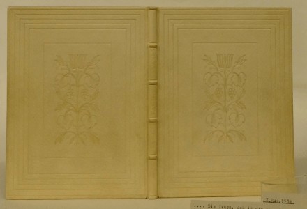
Ten years later, Wiemeler comes back to the combination of framework and central floral motifs with Essays from Francis Bacon, 1934. (Klingspor Museum). An enigmatic fragment of a letter (found in the book and probably written by Wiemeler to his collector) dated ‘7. Aug. 1934 [I quote] …Sie sehen, daß ich mich von allem Modischen wieder frei machte und nur dem eigenen Gefühl folgte. Das ist schließlich ein Gewinn der letzten Jahre, man mußte einsehen, daß alle Gemeinschaftsgefühle, propagierten Moden, mögen sie sich…[kollektiv???]’ It is cut here. If I try to translate: ‘You see that I disentangled myself from all the fashionable — and that I follow my own feelings. That is the benefit of the last years, one had to recognize, that all sense of community…‘. How to interpret this incomplete message? I let my colleague Stefan Soltek, the director of the Klingspor Museum do it: While the influence of the typography is growing in Wiemeler’s style, as we will discover in a moment, the floral decoration persists. His interpretation of this general phenomenon lies in the instable situation of the time, as he wrote in an article on the graphic work of Josef Weisz: ‘Buchkunst zwischen Himmel und Erde’ in the catalogue Weltanschauung im Holzschnitt (1995), in Braunschweig: ‘After the First World War, economic and financial crisis and the rise of Nazis in Germany, artist’s occupation with flowers and nature is a religious and humanistic statement for peace and the harmony between mankind and nature’ (to resume it briefly, very simplified).
But Wiemeler’s sense for flowers and for symmetry shows also in another field:
Wiemeler and Offenbach: The leather goods industry
I repeat: in 1921, the then director of the Technische Lehranstalten had asked Wiemeler to come to Offenbach, the center of the German leather goods industry, to give them fresh impetus after the war. Hugo Eberhardt had huge expectations, but in this Wiemeler failed. He tried hard but his beautiful, and so sophisticated, designs were not to be produced in an industrial process.
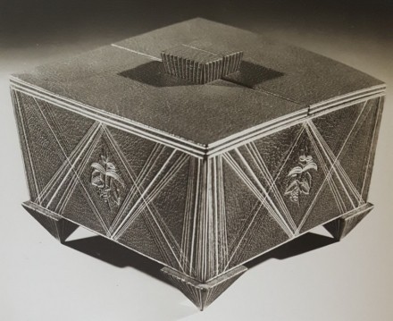
The elements we meet in KL 4 Big casket, red leather, gilded tooled decoration from 1921 are exquisite red leather and a simple cubic form that diminishes towards the pyramidal feet. The golden lines are not parallels but radials that cut around a floral pattern. Let me insert two bindings at this point, as their style seems rather close.
KL 57 Wieland, Geron der Adlige. 1924-1926. Klingspor Museum
KL 90 Benvenuto Cellini. Deutsch von Goethe. Klingspor Museum. Londenberg dates it 1925 – 1933. In comparison with the casket, seen the floral leaf patterns in the edges, I would definitely opt for the earliest date in the mid-1920’s.
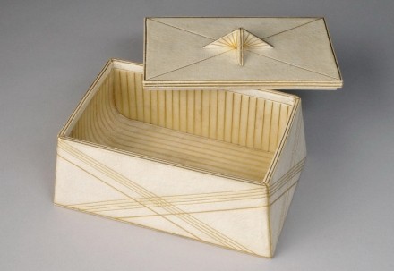
But to go back to the leather goods, this time an elegant trapezoid white box with crossed golden lines which contrast with its inside design: the curved lines being the opposite of the angular exterior. The handle for sure would not be easy to manufacture industrially.
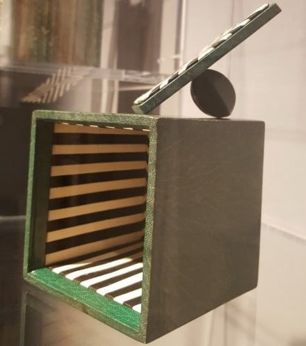
At the opposite, an unpretentious green cube shaped box with a black and white striped textile lining could be seen as an attempt to do simple designs for in line production.
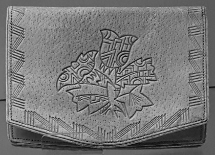
A card holder shows the now well-known floral and geometrical pattern, a zigzag of 4 parallels I would describe as simultaneously being dynamic and architectural, like the pylons and ropes of a modern bridge.
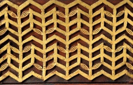
Triangle Box with cut out and gilded decoration, Detail. Deutsches Ledermuseum Offenbach. (Photo: DLM / C. Perl-Appl.)
And Wiemeler tried out also a cut-of-décor with gilded parts on a small triangular box.
But his mastery, and I guess also his preferences when working the leather, are shown by the wonderfully shaped brown box from the collection of the German Leathermuseum. It is a jewel in itself. We again come across the bundles of gilded lines, intercrossing, and the playful just implied florals. And the curved borders, the oblique feet – very fascinating, but, you will certainly agree with me, these prototypes were not destined to be realized in line production.

Bookbindings from the collection of the German Leathermuseum, from left to right: Häusler, Fratzscher, Wiemeler (the last from 1930). (Photo: DLM / C. Perl-Appl.)
Instead of bowing down under the needs of the industry, Wiemeler – and also his colleagues, Philipp Michael Häusler (1886-1966) and Otto Fratzscher (1895-1979), the latter was the head of the workshop at the art school and then Wiemeler’s successor – created a new bookbinding style in close cooperation and under the influence of the designer-typographer Rudolf Koch. Born in Nuremberg in 1876 and formerly working in Leipzig, a city that is very much known for graphic art and print, Koch had joined the Klingspor foundry by 1906. More than 20 type fonts were created by his hand, and he very much influenced the bookbinding masters. I would call it an ‘Offenbach Typography Style’ of bookbindings.
Wiemeler left Offenbach in 1925 for Leipzig. But it seems to me that he had taken new inspirations with him.
Wiemeler in Leipzig 1925 to 1933/1936, the time of his return to nature
Let’s now see what happened to Wiemeler during the Offenbach years and what impact this had at a later date on his work. So far we have seen bookbindings with rigid but rhythmed groups of blind or gilded lines – building frames or columns around a more naturalistic element. This element is now abandoned. The new bindings speak a completely different formal language where the line is the main character that becomes even color, light or abstract landscape, depending on the spacial proximity of the lines.
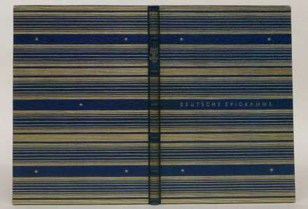
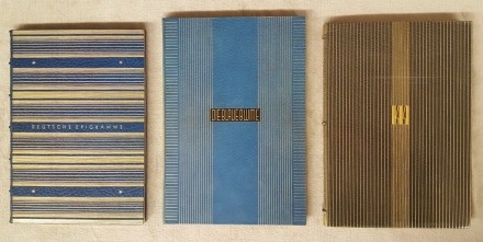
KL 107 Deutsche Epigramme, 1927. Klingspor Museum. The lines create a balance on the cover panels with the empty surface between the lines that is the structured leather. We could characterise this style as rigid, but looking a bit closer at it, considering also the small stars here and there (an element Wiemeler uses increasingly often in his work), the composition gains its own poetry and could be interpreted as a maritime landscape, a wide horizon – or, why not – a rhythmed musical composition. But there is also another element added: The font. Wiemeler seems fascinated by the new characters, so modern, especially the rounded letters.
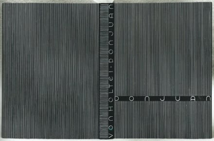
I know the KL 56 Don Juan (Von Holtei, 1924-25) only from Londenbergs photo. It is in a private collection and we do not even know the color. But this graphic design, unifying the surfaces with regular gilded lines and the accentuation of one horizontal line with the title testifies to Wiemeler’s very fine sense of space. Try to abstract the spine and back cover and see only the front board. It’s nothing less than perfect.
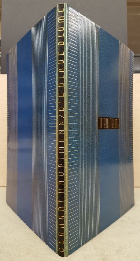
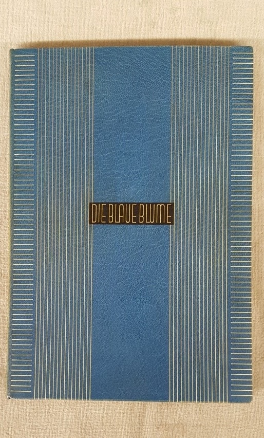
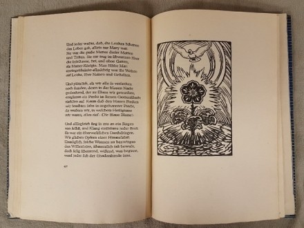
That is true also for KL 59 Gerhard Hauptmann’s Die Blaue Blume in a brilliant skyblue écrasé leather with golden lines and black labels for the title on the front and the spine. And Wiemeler felt free to choose a completely different font for his design that lives from the harmonic contrast of rigidity of the parallel lines and the rounded letters. And again, Wiemeler finds his own interpretation for the print and the woodcuts by the hand of Ludwig von Hofmann.
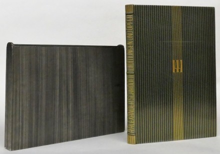
And one more of that style, Rudolf Alexander Schröder, (Widmungen und Opfer, 1925-1931. Klingspor Museum) in a greyish blue, with its paper-covered slip case.
The group of these three bindings allows us to compare Wiemeler’s approach to the surface with lines. Of course, these lines show the proximity to the Wiener Werkstätten and it should be remembered that one of Wiemeler’s teachers in Hamburg had been Carl Otto Czeschka, trained in Vienna. But the rhythm and contrast with the letters add an ingenious detail to the composition.
At the same period, Wiemeler approached surface also with letters, with typography.
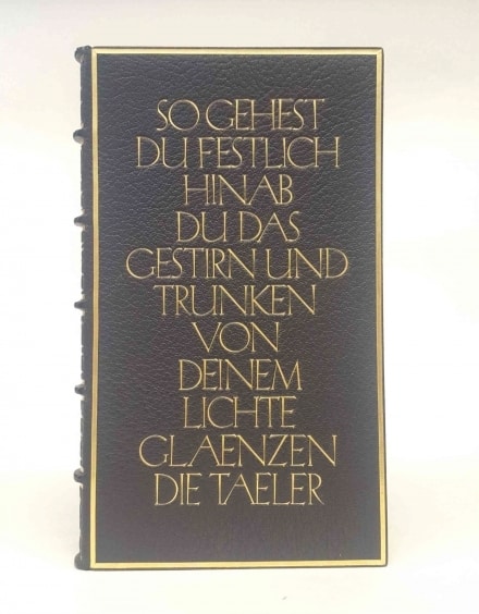
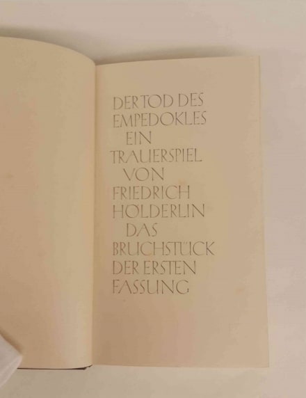
On KL 104 Friedrich Hölderlin, Der Tod des Empedokles, 1926 – 1930 (Klingspor Museum), a quotation fills almost the front board, the back is empty inside a golden frame, but the spine has strong ridges that cut the authors name and the title in even parts with horizontal golden stripes. The book had been printed for Karl Klingspor using an Offenbach Font, Koch-Antiqua, and Wiemeler opted here for the same characters on his binding.
Two books from the same edition have been bound by Otto Fratzscher using the same font, but with letters only. In comparison with Wiemeler’s binding with its gilded frame, Fratzscher’s red binding loses in composition: the letters sort of swim on a surface with no borders while Wiemeler gives the board a limitation with the border.
With variations of the letter-size and the framing, this style persists during the 1930s.
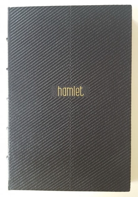
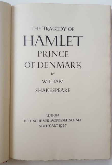
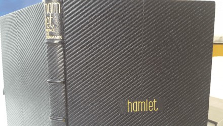
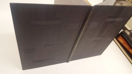
But more like the gilt-lined volumes are two editions of KL 168 William Shakespeare’s, Hamlet, one in Offenbach, 1930, the other KL 115 1929-1931 in Basel. Here again, Wiemeler choses a fine line, rounded typo in contrast to the shadow-and-light-play of positive/negative monochrome lines which shift at the center line or on both sides of the title, creating sections of the surface. On the higher lines, we can see the structure of the leather, while the deeper lines are clean and brilliant.
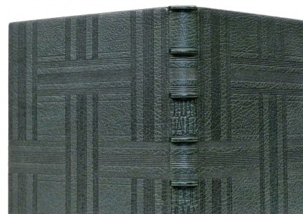
For the dark green binding of KL 138 Arthur Schopenhauer, Aphorismen zur Lebensweishei (1928-1930, Klingspor Museum), the lines create a web in the grained leather. The title would have been too much, so that even the small letters on the spine are only blind lines. And of course, the decoration patterns are mirrored on the title and the backside as on KL 106 Rilke Duineser Elegien, 1927.
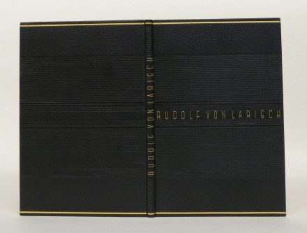
A variation with parallels is KL 136 Fritz Helmuth Ehmcke, Rudolf von Larisc,. 1929 Klingspor Museum.
But we enter into a new group, where Wiemeler’s interest is now not only triple, but quadruple: four elements fight for attention, changing importance or proportions at every volume:
- The surface with the properties, grains and the beauty of his exquisite materials
- The rhythm of the multiple lines or stripes
- The typography with a preference for rounded letters contrasting the geometrical (or musical) composition
- The color or color blocking
And here we go with several examples from the late 1920s until even 1936 (with a question mark).
KL 122 Goethe, Gedichte, 1927 – 1932. A huge binding with lithographs by Max Liebermann, Ernst Barlach e.a. Klingspor Museum, and a very similar composition on KL 167 Johann Wolfgang von Goethe, Torquato Tasso, 1930, Klingspor Museum.
Or the more simple KL 66 Eduard Mörike, Die Hand der Jezerte, 1925 – 1929, Klingspor Museum, that I mention especially for the beautiful lithographs inside and the sophisticated slipcase in wood and three different linings that recall the leather of the book binding and the skyblue silk inside.
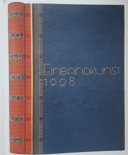
With the Jahrbuch der Einbandkunst, 1928, Klingspor Museum, the colors are very much contrasted.
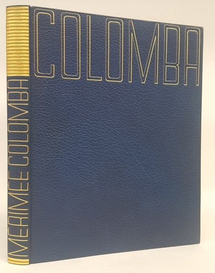
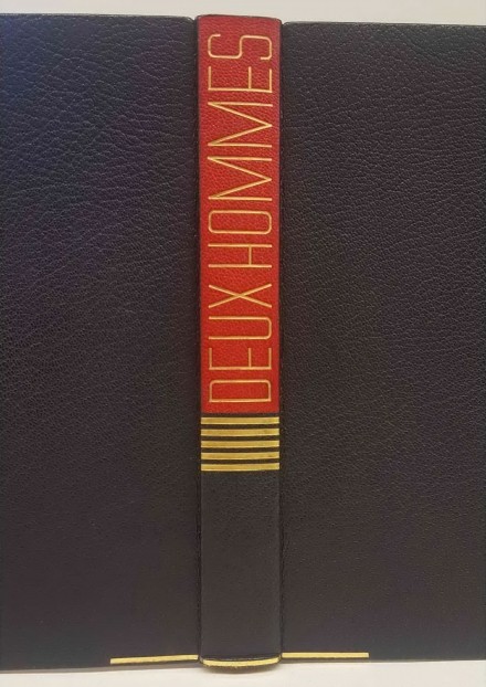
And this style continues, i.e. on KL 89 Friedrich Hebbel, Die Nibelungen, 1925-1933, Klingspor Museum; or on KL 160 Prosper Mérimée, Colomba, 1929-1930, Klingspor Museum, where we should hold in mind the golden line on the basis of the spine that makes also it’s apparition on KL 140 Paul Arène, Jean des Figues, 1928-1931; or in a more accentuated form on KL 102 Georges Duhamel, Deux Hommes, 1926-1933, where the binding shows a surprising use of the partial baseline on both sides of the spine which gives the book an architectural or a static foundation. I think it is a strong element of anchoring the book on the base.
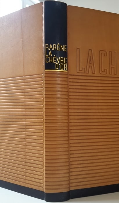
And so is the latest and last example : KL 175 Paul Arène, La Chèvre d‘Or. 1930-1936. Klingspor Museum, where the whole composition is standing on a black baseline going all around and referring to the otherwise parallel blind lines that cover almost all the surfaces.
I end my presentation with some sentences on the conditions of bookbinding at the end of the 1920’s and the beginning of the 1930’s in Germany (as probably also elsewhere). The profession of bookbinders had two contrary developments to deal with. On one side, there were major exhibitions of bookbinding, on the other side the decline in interest in high quality individual or serial bookbindings. Helma Schaefer describes in 1989 in ‘Traditionen Leipziger Buchkunst’ the bad conditions art-bookbinders had to struggle with from 1930 onwards. Small workshops had to close down or to look for new fields of activity.
Luckily, Wiemeler lived in the comfort of his Leipzig professorship and was even able to help less fortunate colleagues in giving them a living as assistants at the Academy. In addition, he still had some regular customers, the already named Karl Klingspor in Offenbach and Richard Doetsch-Benziger in Switzerland, and we can add the librarian Ernst Kyrill.
The rise of the Nazis was followed in general by a forced return to a pseudo-historical ornamental esthetic and a lack of good bookbinding leathers due to reduced imports from Great Britain. As we know, Wiemeler was very demanding when choosing his leathers and he destroyed sometimes half-finished bindings when he discovered minor stains in the surface of his binding to start again with impeccable material.
To finish, I quote a journalist in Wiemeler’s obituary in 1952 in Die Zeit, the German weekly newspaper. ‘In 1937, a British correspondent for the Paris world exhibition wrote: “Where is Ignatz Wiemeler? He is lacking in the German exhibition – or is his style so well adapted to the Third Reich so that his character is no longer visible?” No, no adaptation, he was not present for purpose. Can there be a more compelling evidence for the international validity of this bookbinder as these foreign press voice?’ (5 June 1952, Die Zeit n° 23/1952).
We know from Londenberg that Wiemeler preferred to go to a London fair instead of going to Paris, as he still felt closer to the British bookbinding tradition than to the more and more figurative French Art Deco. But frankly, I think that he was mostly true to himself and to his own individual style.
Basic sources
Ignatz Wiemeler, Modern Bookbinder. [exhibition] The Museum of Modern Art, New York, 1935.
Helmut Presser, Ignatz Wiemeler / Buchbinder 1895 bis 1952. Herausgeber, Maximilian-Gesellschaft e.V., Hamburg 1953.
Ignatz Wiemeler: Werkverzeichnis. Bearbeitet und zusammengestellt von Kurt Londenberg. Herausgeber, Maximilian-Gesellschaft e.V., Hamburg 1990 (KL).
Helma Schaefer, ‘Ignatz Wiemeler’, in Traditionen Leipziger Buchkunst, Leipzig 1989.
[1] Information from the website of the Klingspor Museum.
